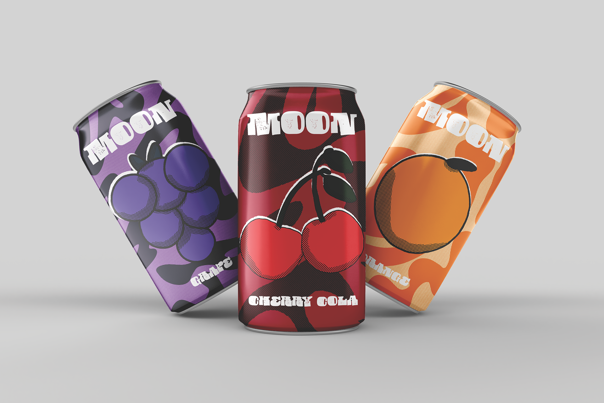
The concept for Moon was simple: a soda brand that referenced retro design in its packaging.
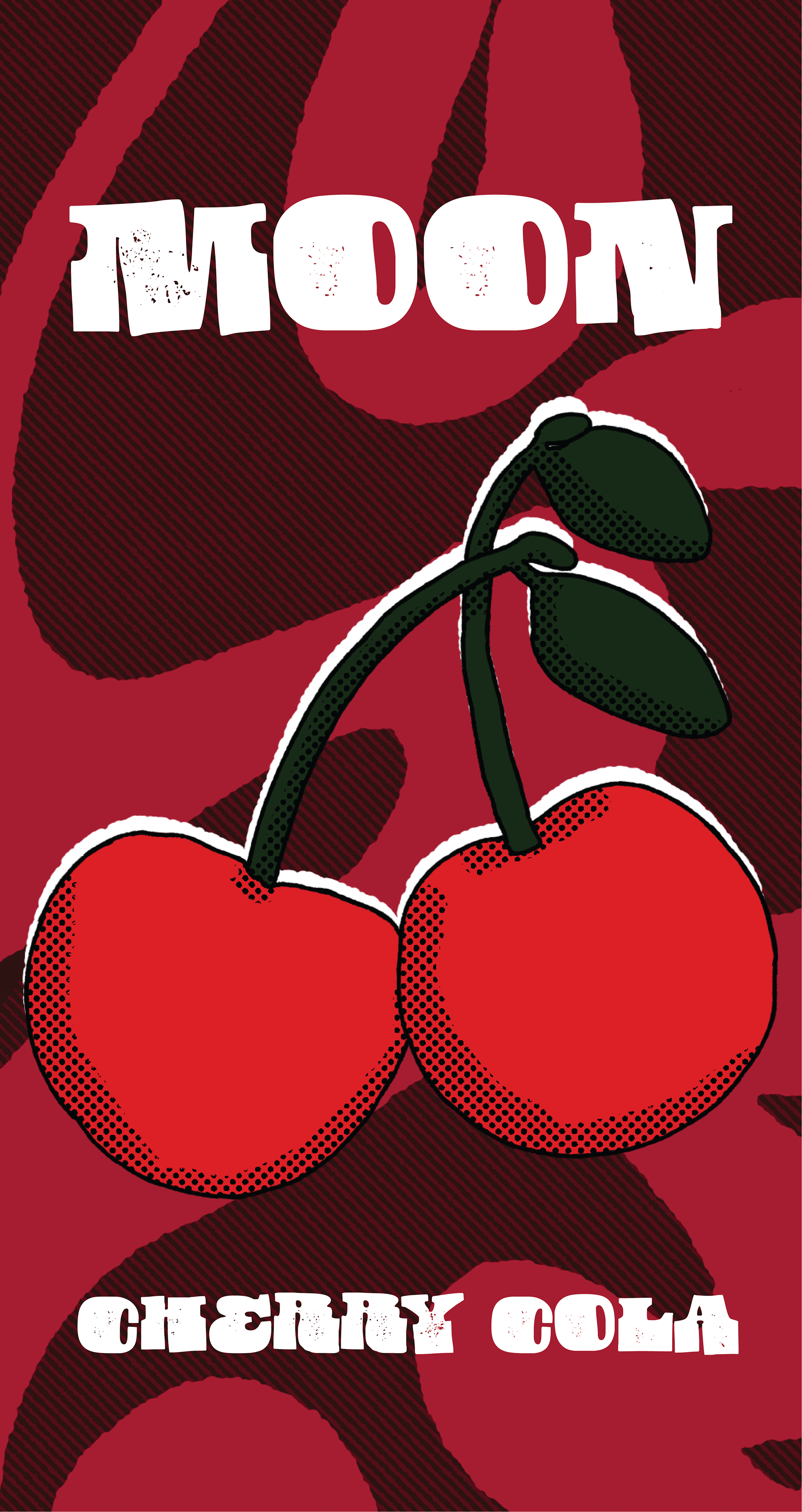
Each design is meant to resemble the design trends of the 60s and 70s. I used halftones and lines for shading to create a look that pops right at you.